Analysing Usain Bolt using GeoGebra/Document: Difference between revisions
No edit summary |
No edit summary |
||
| Line 67: | Line 67: | ||
[[Image:BoltImage3.png]] | [[Image:BoltImage3.png]] | ||
The red graphs are the velocity and acceleration models from Bejing 2008, with Berlin 2009 in blue and London 2012 in green. The first thing we notice is that there is a remarkable similarity between the shapes of the graphs and the closeness of fit of the displacement-time graph to the data. In each case the acceleration graphs have a minimum, a maximum and a zero which effectively divide each run into 4 stages. After an initial acceleration off the blocks of around 10 ms<sup>-2</sup>, the first stage of around 4 seconds corresponds to a decrease in the acceleration to around zero. Then there is a second stage up to just over 6 seconds when he accelerates again to around 1 ms<sup>-2 </sup>at around 57m. After this there is a third stage until around 7.5 seconds when his acceleration becomes zero and he hits his maximum velocity of around 13 ms<sup>-1</sup>at around 75m. The fourth and final stage is until he crosses the finishing line. It is here that there is most difference between the runs – depending on closely challenged Bolt was at that stage. In Bejing he had left the field standing, and started his celebrations well before crossing the line! This accounts for the low value of his final velocity and the extent of his deceleration, as well as a less good fit for the displacement data at the end of the race. What we can now do is to try to predict the time Bolt might have recorded had the race been more closely fought so that he had keep running at his best right until the finishing tape. We just need to experiment with the value in cell B12. So it must just have been that he had the potential to record a world record shattering 9.5 seconds if only the other runners had kept pace! | <br /> | ||
The red graphs are the velocity and acceleration models from Bejing 2008, with Berlin 2009 in blue and London 2012 in green. The first thing we notice is that there is a remarkable similarity between the shapes of the graphs and the closeness of fit of the displacement-time graph to the data. In each case the acceleration graphs have a minimum, a maximum and a zero which effectively divide each run into 4 stages. After an initial acceleration off the blocks of around 10 ms<sup>-2</sup>, the first stage of around 4 seconds corresponds to a decrease in the acceleration to around zero. Then there is a second stage up to just over 6 seconds when he accelerates again to around 1 ms<sup>-2 </sup>at around 57m. After this there is a third stage until around 7.5 seconds when his acceleration becomes zero and he hits his maximum velocity of around 13 ms<sup>-1</sup>at around 75m. The fourth and final stage is until he crosses the finishing line. It is here that there is most difference between the runs – depending on closely challenged Bolt was at that stage. In Bejing he had left the field standing, and started his celebrations well before crossing the line! This accounts for the low value of his final velocity and the extent of his deceleration, as well as a less good fit for the displacement data at the end of the race. What we can now do is to try to predict the time Bolt might have recorded had the race been more closely fought so that he had keep running at his best right until the finishing tape. We just need to experiment with the value in cell B12. So it must just have been that he had the potential to record a world record shattering 9.5 seconds if only the other runners had kept pace!<br /> | |||
[[Image:BoltImage4.png]] | [[Image:BoltImage4.png]] | ||
Latest revision as of 15:44, 14 November 2012
Usain Bolt’s track record – why Bejing was a Bolt from the blue. Adrian Oldknow adrian@ccite.org
The summer of 2012 has seen the culmination of the very successful London 2012 Olympic Games with the Jamaican sprinter, Usain Bolt, taking gold medals in the men’s sprint events. While we do not yet have official 10m split timings from the International Association of Athletics Federations (IAAF), there are now some postings of his 20m split times on the Internet: http://speedendurance.com/2012/08/09/usain-bolt-20-meter-splits-london-2012-olympics/. The technique for statistical analysis used here recognises that the displacement and velocity are both zero until the runner leaves the blocks. This does not happen just as the starting pistol is fired, but slightly later due to the athlete’s reaction time delay, RT. For Bolt at the London 2012 Olympics, this was estimated at 0.165 s. So if we try to fit a polynomial regression model to the time v distance data it should have (x-RT) as a double factor. So the trick is to divide the distance data values y by the factor (x-RT)2, where x is the time data value, and then to fit a polynomial regression model, such as a cubic, to the resulting data points, ignoring the initial (RT,0) data point. This technique gives a good fit to the data.
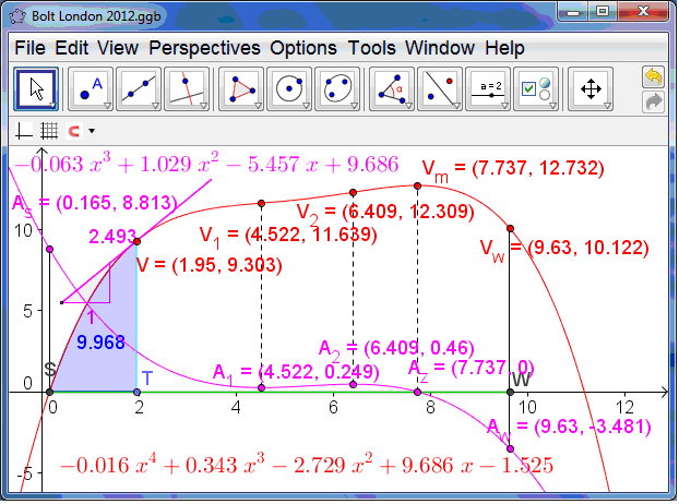
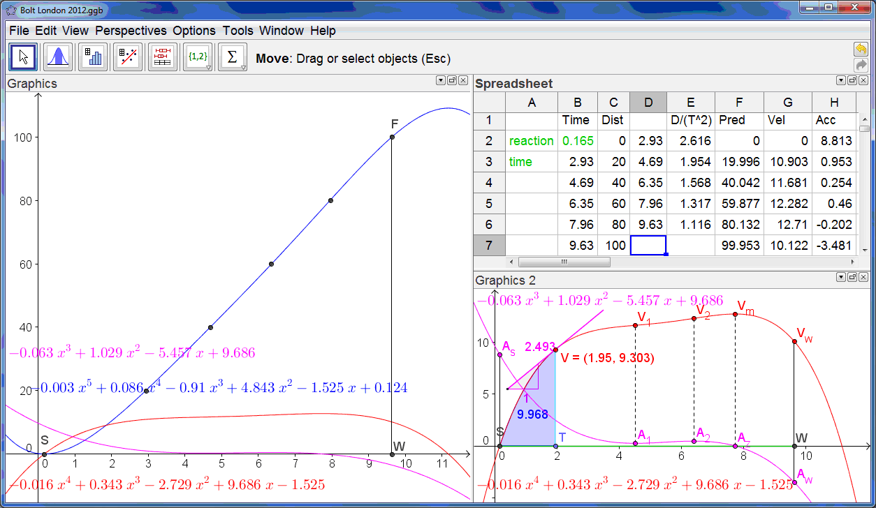
The whole story can be read from the estimated velocity time graph – which is a quartic polynomial passing through (0,RT). The GeoGebra screen shows three views. On the left is the main Graphics view showing the scattergram of the data points being well fitted by the blue fifth-degree (quintic) displacement time graph. Superimposed on this are the red velocity-time quartic and the purple acceleration-time cubic graphs. In the upper right corner is the Spreadsheet view. The raw data are in columns B (time) and C (displacement) – and columns D and E hold the transformed data to which the cubic polynomial regression model is fitted. Column F has the distances predicted from our fifth degree displacement-time model. Columns G and H show the corresponding estimates for the velocity and acceleration at the 20m splits. In the bottom right corner is the Graphics 2 View – where we can read the story of the race. The green segment SW on the x-axis represents the clock, and the point T is set up to slide on it. The x-value of T, currently 1.95 s., gives the time elapsed since Bolt left the blocks. The point V on the red graph represents the velocity at the chosen time, currently 9.303 ms-1. The purple line through V is the tangent to the red graph at V, and its slope, shown in purple represents the acceleration, currently 2.493 ms-2. The blue shaded area under the curve between S and T is the numerical integral of the red quartic and represents the distance travelled, currently 9.968 metres.

Looking at the acceleration-time graph we see there is a minimum at A1, a maximum at A2 and a zero at Az. These correspond to the inflections of the velocity at V1 and V2, and the maximum at Vm. The initial acceleration off the starting blocks, at As, is estimated at 8.813 ms-2, and by the finish, at Aw, his acceleration appears to be -3.481 ms-2. Remember we are not modelling Bolt’s movement stride by stride – which is a pretty complex dynamical system. Think instead of being the operator of the remote controlled camera running smoothly on a track alongside Bolt speeding up and slowing down to match where Bolt currently is!
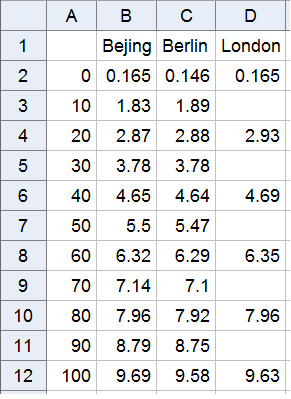
Now we can compare this picture of the Bolt 2012 run with those in Bejing in 2008 and in Berlin in 2009. Data for these runs can be found at: http://berlin.iaaf.org/records/biomechanics/index.html. For each of these runs we actually have timings for each of the 10m splits – together with the estimated reaction time:
| Bolt | 0 | 10 | 20 | 30 | 40 | 50 | 60 | 70 | 80 | 90 | 100 |
| 2008 | 0.165 | 1.83 | 2.87 | 3.78 | 4.65 | 5.5 | 6.32 | 7.14 | 7.96 | 8.79 | 9.69 |
| 2009 | 0.146 | 1.89 | 2.88 | 3.78 | 4.64 | 5.47 | 6.29 | 7.10 | 7.92 | 8.75 | 9.58 |
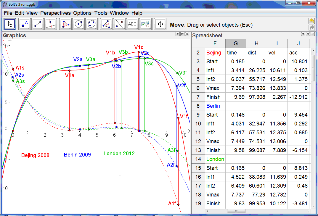
Here we can gather together all the analysis visually in a single Graphics View, with the relevant data shown in a table within a single Spreadsheet View.
The red graphs are the velocity and acceleration models from Bejing 2008, with Berlin 2009 in blue and London 2012 in green. The first thing we notice is that there is a remarkable similarity between the shapes of the graphs and the closeness of fit of the displacement-time graph to the data. In each case the acceleration graphs have a minimum, a maximum and a zero which effectively divide each run into 4 stages. After an initial acceleration off the blocks of around 10 ms-2, the first stage of around 4 seconds corresponds to a decrease in the acceleration to around zero. Then there is a second stage up to just over 6 seconds when he accelerates again to around 1 ms-2 at around 57m. After this there is a third stage until around 7.5 seconds when his acceleration becomes zero and he hits his maximum velocity of around 13 ms-1at around 75m. The fourth and final stage is until he crosses the finishing line. It is here that there is most difference between the runs – depending on closely challenged Bolt was at that stage. In Bejing he had left the field standing, and started his celebrations well before crossing the line! This accounts for the low value of his final velocity and the extent of his deceleration, as well as a less good fit for the displacement data at the end of the race. What we can now do is to try to predict the time Bolt might have recorded had the race been more closely fought so that he had keep running at his best right until the finishing tape. We just need to experiment with the value in cell B12. So it must just have been that he had the potential to record a world record shattering 9.5 seconds if only the other runners had kept pace!


